


Introduction
A home services company in Allen, TX came to Web Designer Factory last spring with a strange problem. Their site looked more modern than ever. A new sticky header, an exit pop-up, and a shiny chat widget had all been added by a previous agency in the same redesign. Traffic held steady. Conversions dropped.
When our team ran a full audit, the culprit was not the individual features. It was how they were built and timed. The pop-up fired the instant a visitor landed on the page. The chat widget opened automatically with a sound. The sticky header ate up nearly a quarter of the mobile screen. None of these features were bad ideas on their own. They were just implemented without any thought for how a real visitor would experience all three stacked on top of each other.
That project is a useful case study, because it captures a tension every business owner runs into. Sticky headers, pop-ups, and chat widgets are everywhere because, done right, they genuinely work. Done wrong, they push visitors toward the back button before your message ever lands. The difference almost always comes down to timing, placement, and restraint, not whether to use the feature at all.
Here is how to tell which of these elements are earning their place on your site, and which ones are quietly costing you leads.
Key Takeaways
- Sticky headers tend to help conversions, but only when they are kept thin and focused on one clear call to action, especially on mobile
- Pop-ups are the most likely feature to backfire. Delaying them until exit intent or meaningful scroll depth performs far better than firing them on page load
- Google’s page experience guidelines specifically flag intrusive interstitials that block content on mobile, which can affect both user experience and search visibility
- Chat widgets only help if someone is actually monitoring them. An unanswered chat trains visitors to distrust the entire site
- The businesses that get this right treat these features as a system built around the visitor’s attention, not three separate tools bolted on independently
Sticky Headers: Usually a Win, If You Keep Them Light
A sticky header (one that stays fixed at the top of the page as a visitor scrolls) keeps your logo, main navigation, and a call-to-action button always in view. For most small business sites, this helps more than it hurts.
Why it works:
- Visitors do not have to scroll back to the top to call you, request a quote, or find a menu item
- It keeps your phone number or “Get a Quote” button visible at every scroll depth, which matters most on mobile
- It reinforces branding without demanding anything from the visitor
Where it goes wrong:
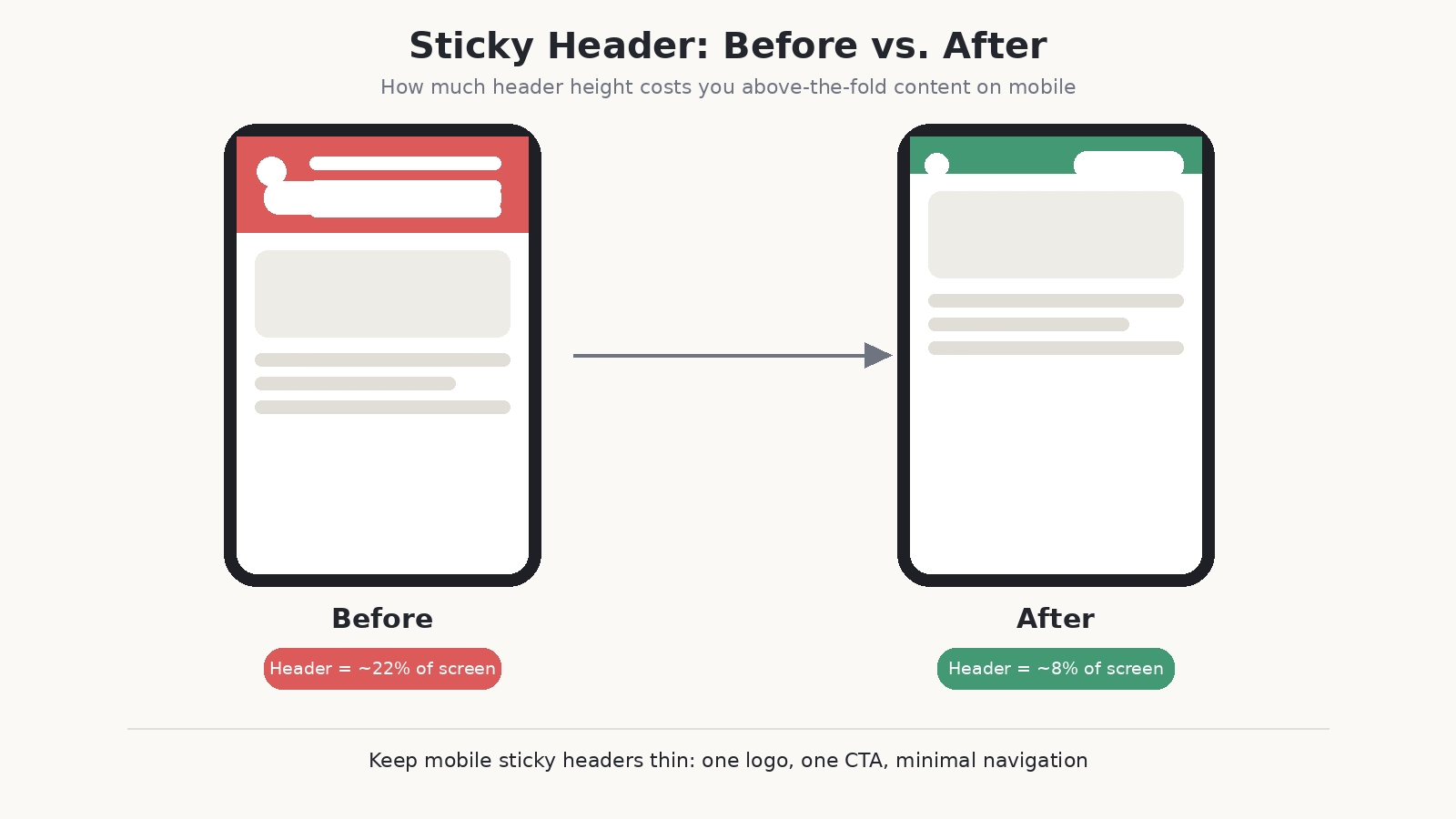
- Headers that take up too much vertical space on mobile, sometimes 15 to 20 percent of the screen, crowd out the actual content
- Too many links or dropdowns crammed into the sticky bar slow the page down and clutter the experience
- Laggy animations or shadows on scroll create a rough, unfinished feel
The fix: Keep the sticky header thin, especially on mobile. One clear call-to-action button, your logo, and minimal navigation is plenty. For service businesses, that CTA should almost always be “Call Now” or “Get a Free Quote,” not a generic “Learn More.” This is one of the first things our team checks during every web design audit, because a bloated header is an easy fix with an outsized impact on mobile conversions.
Pop-ups: The Feature Most Likely to Backfire
Pop-ups have the worst reputation of the three, and often for good reason. A pop-up asking for an email address before a visitor has read a single sentence is one of the fastest ways to lose them.
Why they backfire:
- Interrupting a visitor before they have seen any value feels like a bait and switch
- Pop-ups that are hard to close, especially on mobile where the “X” button is often tiny or mispositioned, actively frustrate people
- Google has explicitly called out intrusive interstitials as page elements that can hurt both usability and search performance when they block content, particularly on mobile
Why they can still work:
- Exit-intent pop-ups, triggered when a visitor is about to leave, capture people who were already about to bounce, so there is less to lose
- Scroll-triggered pop-ups that appear after someone has read 50 to 70 percent of a page tend to convert better, because the visitor has already shown genuine interest
- Usability research from Nielsen Norman Group has found that exit-intent pop-ups can provide a good experience and real benefit to users, but only when the offer is relevant and the tone invites rather than demands
The fix: Delay pop-ups. Trigger them on exit intent or after meaningful scroll depth, never on page load. Make the close button large and obvious, especially on a phone screen. Limit yourself to one pop-up per session. Stacking multiple offers is a fast way to feel like a used car lot instead of a business someone trusts.
Chat Widgets: Helpful Only When They Are Actually Helpful
Chat widgets sit in an interesting middle ground. Visitors generally like the idea of getting a quick answer without picking up the phone or filling out a form. But a lot of chat widgets fail at the one thing they are supposed to do, which is respond.
Why they work:
- They lower the barrier for visitors who have a quick question but are not ready to call
- For service businesses, a chat that answers “Do you serve my area?” or “What is your starting price?” can turn a hesitant browser into a lead on the spot
- Data compiled by LiveChat’s 2026 industry research shows businesses using live chat report meaningful increases in conversion rates and average order value, largely because live chat resolves buying hesitation in real time rather than after a delay
Why they hurt:
- An unstaffed chat widget that never responds trains visitors to distrust it, and by extension, distrust your site
- Widgets that auto-open with a sound or animation on page load are jarring and often get closed immediately
- Poorly configured bots that cannot answer basic questions frustrate visitors more than having no chat at all
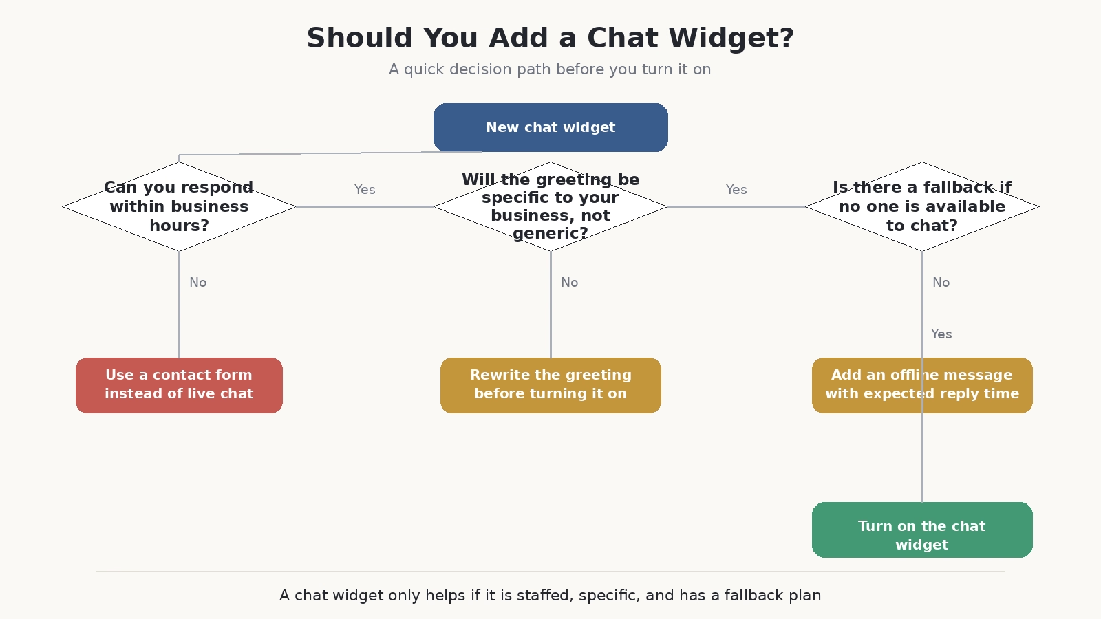
The fix: If you cannot staff live chat during business hours, use a simple contact form instead, or set clear expectations such as “We typically reply within one business hour” so visitors are not left wondering if anyone is on the other end. Let the widget open on click, not automatically, and keep the first message short and specific to your business rather than a generic greeting. Getting this right is closely tied to how well your broader lead generation system captures and follows up on interest, since a chat widget is only as good as the process behind it.
The Real Question: Are You Solving a Problem or Adding Noise?
Every one of these features exists to solve a real conversion problem. Making it easier to act. Capturing an interested visitor before they leave. Answering a question in real time. The mistake most businesses make is not using them. It is using all three at once, at full intensity, without thinking about how a real visitor experiences them stacked on top of each other, the same issue our Allen, TX client ran into before their redesign.
Before adding, or keeping, any of these on your site, ask:
- Is this helping the visitor accomplish something, or interrupting them from doing it?
- Would I be annoyed if I encountered this exact experience on someone else’s site?
- Is there a person or system on the other end that will actually follow through?
If the honest answer to any of those is no, that is the feature to fix first, not the next one to add.
Final Thoughts
Sticky headers, pop-ups, and chat widgets are not inherently good or bad for conversions. They are tools, and like any tool, their impact depends entirely on how thoughtfully they are built and timed. The businesses that get the most value from them treat these elements as part of one connected visitor experience, not three separate features added independently over time.
If your site has accumulated a mix of these features over several redesigns and you are not sure whether they are helping or quietly working against you, a full conversion audit is often the fastest way to find out. Contact Web Designer Factory to talk through what is happening on your site today.
Frequently Asked Questions
Do pop-ups always hurt SEO?
Not always. Google’s guidance specifically targets pop-ups and interstitials that block main content, particularly on mobile immediately after a visitor arrives from a search result. Exit-intent pop-ups, scroll-triggered pop-ups, and small non-intrusive banners generally fall outside that penalty, since they do not obstruct the visitor’s initial access to the content they came for.
How long should I wait before showing a pop-up?
There is no single universal number, but a common approach is to delay pop-ups until a visitor has scrolled through 50 to 70 percent of the page, or to trigger them only on exit intent. Both approaches show the offer to visitors who have already demonstrated interest rather than interrupting someone who just arrived.
Is a sticky header bad for mobile page speed?
A well-built sticky header has a minimal impact on load time. The bigger risk on mobile is not speed but screen space. A sticky header that takes up too much vertical real estate pushes content further down the screen and can hurt the experience even if the page technically loads quickly.
Should every small business have a live chat widget?
Not necessarily. A chat widget only helps if someone can respond within a reasonable window during business hours. If staffing chat consistently is not realistic, a well-designed contact form with clear response-time expectations is often a better fit than a chat widget that goes unanswered.
What is the single most common mistake businesses make with these three features?
Adding all three at once without considering how they interact. A sticky header, an early pop-up, and an auto-opening chat widget can each be reasonable on their own, but stacked together on a first visit, they overwhelm the visitor before they have had a chance to read anything.